Every site has a page nobody designs for: the 404. A visitor mistypes a URL, follows a stale backlink, or lands on a post that moved — and meets a dead end. On most sites that moment ends the session. The visitor bounces, the analytics record a one-page visit, and whatever the acquisition channel cost, it just bought an exit.
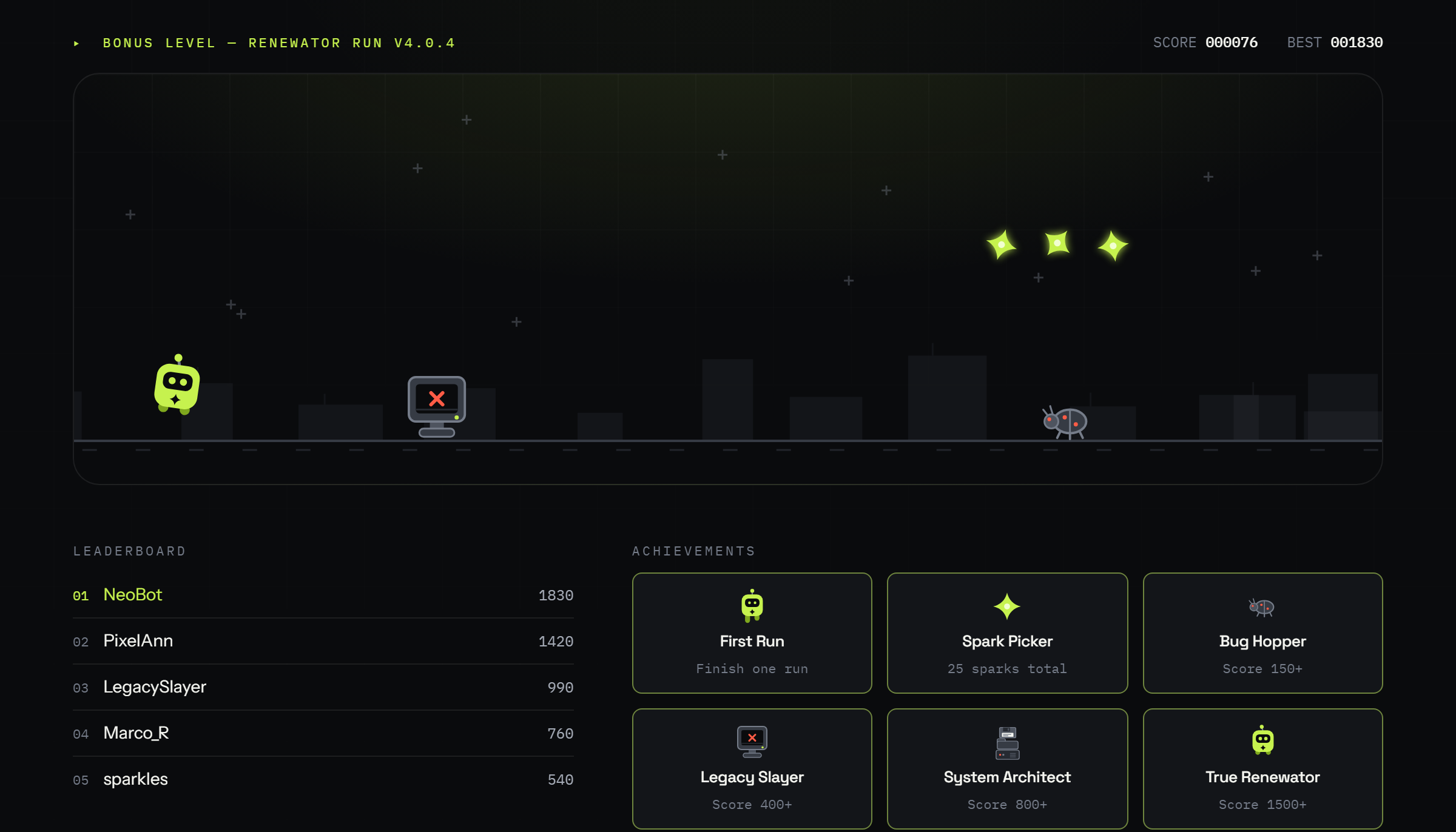
We decided our error page should earn its keep. Instead of a plain “page not found,” visitors to renewator.com now find Renewator Run — a small endless-runner game drawn in our design system, with a public leaderboard, achievement badges, and product facts woven into the gameplay. This post explains why a “toy” is a serious engagement tool, how we built it, and what we measure.
Why the 404 page is an engagement problem
Error pages are more common than most owners think. After a platform migration — like our own move from WordPress to a static architecture — old URLs, syndicated links, and search snippets keep sending traffic to addresses that no longer resolve. Even with careful redirects, a large content archive guarantees a steady trickle of 404 sessions.
The default outcome of those sessions is bad on every axis:
- Behavioral signals. A visit that starts and ends on an error page is a short, single-page session. Whatever weight search engines give engagement patterns, a stream of instant exits from your domain tells a poor story — and it certainly pollutes your own analytics with noise that hides real content problems.
- Wasted acquisition. A visitor from a backlink or a SERP already chose you. Letting them leave over a routing artifact wastes the hardest part of the funnel — getting attention in the first place.
- Brand impression. A generic error page reads as neglect. For a company that sells custom software and UI/UX design, the error page is a portfolio piece whether we like it or not.
What we built: a runner game in the design system
Renewator Run is a canvas-based endless runner, in the spirit of the browser dinosaur game, but drawn entirely with our own tokens — the same acid-lime accent, ink palette, and monospace labels the rest of the site uses. Our robot mascot sprints past “legacy tech” obstacles: crashed CRT monitors, software bugs, floppy-disk stacks, tangled cables, and flying floppy drones. One control — Space or tap to jump — works identically on desktop and mobile.
The game is deliberately more than a distraction:
- Product facts as gameplay. Every few hundred points, a non-blocking card surfaces a fact or a tip — what our AI integration services do, why a tech roadmap matters, a link to a relevant article on the blog. The player keeps playing; the message lands anyway.
- A leaderboard with nicknames. Scores are saved under a nickname to a public top-10. Competition is a return-visit engine: a beaten record is a reason to come back.
- Achievements. Six badges — from “First Run” to “True Renewator” — sit under the game and unlock as scores grow. Visible locked states give players a ladder to climb.
- Opt-in email capture. Saving a record offers an optional email field with explicit consent. Those addresses flow straight into our CRM as a distinct audience — people who chose to play with the brand. It is the friendliest lead source we have: nobody was interrupted, everybody opted in.
- A conversion path. The game-over screen keeps a “Start a project” link alongside “Run again.” The framing writes itself: in the game you dodge legacy tech — in real projects, we remove it for you.
Under the hood: engineering choices that matter
A mini game only works as an engagement tool if it costs nothing to load and feels good to play. Both are engineering problems, and the details are where most “fun 404 page” experiments quietly fail.
Rendering. The game is a single Canvas 2D scene — no game engine, no external libraries, nothing fetched from a CDN. The art is nine hand-drawn SVG sprites (about 10 KB total) rasterized once at load. Rendering is devicePixelRatio-aware (capped at 2× to keep phone GPUs cool), and the requestAnimationFrame loop runs only while a run or a particle effect is active — an idle 404 page consumes zero animation frames and zero battery.
Game feel. The difference between “cute demo” and “one more try” is measured in milliseconds. The jump uses two forgiveness mechanics borrowed from platformer design: coyote time (an 80 ms grace window to jump after running off an edge state) and an input buffer (a jump pressed up to 90 ms before landing fires on touchdown). Holding the button extends the arc — variable jump height gives players a skill axis. The bot squashes on landing and stretches on takeoff, straight from the classic animation principles; physics runs on clamped delta-time so a background tab or a slow frame never teleports the player into an obstacle.
Responsive difficulty. On narrow screens, reaction distance is the scarce resource. Below 560 px the world scales to 0.82×, start and top speeds drop, and a blinking edge marker announces the next obstacle while it is still off-screen. Difficulty tiers unlock by score, so the first ten seconds are winnable for everyone — losing instantly on mobile is the fastest way to turn a retention feature into an annoyance.
The backend is boring on purpose. Scores go through a tiny endpoint with per-IP rate limiting, a hard score-sanity cap, and nickname sanitization; the leaderboard keeps each player’s best via a single DISTINCT ON query. Emails are stored only with an explicit consent checkbox, deduplicated per address, and land in the same CRM pipeline as our regular leads — tagged as a separate audience. Accessibility is not skipped either: every particle effect and screen shake respects prefers-reduced-motion, and the whole page still returns a proper HTTP 404.
None of this is exotic. It is the same discipline we apply to custom software at production scale — applied to a toy, because the toy carries the brand.
What this does to behavioral metrics
Honest framing first: nobody outside Google knows exactly how (or whether) dwell time and bounce rate feed rankings, and we do not sell gamification as an SEO trick. What we can measure — and what any owner can verify in their own analytics — is the direct behavioral change on the page itself:
- Session depth and duration. A 404 visit that used to last four seconds becomes a two-minute play session, often followed by a click to the blog, the portfolio, or the services page through the fact cards.
- Exit-to-navigation ratio. The page now has many soft paths onward — fact-card links, achievements, the header — so a wrong URL turns into an internal navigation event instead of an exit.
- Return visits. Leaderboard positions decay; players come back. A bookmarked error page is a strange asset to have, but we will take it.
We track this with a handful of privacy-friendly analytics events — game started, game over (with score), record saved (with or without email), and the project CTA click — and read them as a funnel with explicit definitions:
- Play rate = game starts ÷ 404 sessions. The share of stranded visitors the page manages to catch.
- Session depth = game-over events per start, plus the score distribution. Rising median score means the difficulty curve is teaching, not punishing.
- Save rate = records saved ÷ games finished, and within it the opt-in rate — saves that included an email. This is the page’s direct contribution to the mailing base.
- CTA rate = “Start a project” clicks ÷ game-over screens shown. The conversion tail of the funnel.
Each event carries the page path, so the same funnel works for the 404 page and for embeds like the one below this article. That instrumentation is what separates engineering from decoration: we can see exactly how many dead-end sessions convert into play, into subscribers, and into project conversations — and kill the feature honestly if the numbers ever say it stopped earning its bytes.
An implementation checklist you can reuse
If you want the same effect on your own site, the pattern is portable:
- Keep the correct status code. The page must still return HTTP 404 — a “soft 404” that returns 200 would trade a UX win for an indexing problem.
- Draw it in your design system. The game should look like your brand, not like an embedded arcade widget. Ours uses the site’s fonts, colors, and spacing tokens end to end.
- One-input controls. Space, click, tap — the same action everywhere. If it needs instructions longer than one line, it is too complex for an error page.
- Make the content work. Rotate genuinely useful facts and links into the game loop. The game holds attention; the cards spend it on your products.
- Ask, don’t grab. Email capture must be optional and consent-based. An error page that demands sign-up is worse than a plain one.
- Instrument everything. Fire analytics events for start, finish, save, and CTA clicks, and watch the funnel — otherwise you are decorating, not engineering.
- Stay light. Static assets, no external libraries, canvas rendering. Our game adds a few kilobytes of SVG and one script; the error page still loads instantly on mobile.
The bigger point
The 404 game is a small build — a weekend-scale project against the scale of a digital transformation engagement. But it reflects the approach we bring to bigger systems: find the place where users currently fall out, and re-engineer it so the same moment produces engagement, data, and pipeline instead. Dead ends are design material.
If your product has its own “404 moments” — drop-off screens, empty states, error flows that quietly leak users — that is exactly the kind of problem we like. Tell us about it, or just try to beat the leaderboard right now.
Try it yourself
No need to mistype a URL: the exact build that runs on our 404 page is embedded below — same physics, same leaderboard, same achievements. Space or tap to jump. If you make the top-10, that’s a real record on renewator.com.